Ink Properties Explained: Shading, Sheen, Shimmer and Saturation
Ink is not one thing. Two bottles can sit side by side on a shelf, look almost identical, and behave nothing alike once they meet paper. One lays down a flat, even line. Another shifts from pale blue to near-black as your pen crosses the page. A third glitters like wet tarmac. Those differences come down to four characteristics — shading, sheen, shimmer and saturation — and understanding them turns ink buying from guesswork into something closer to choosing a tool.
Shading: light and dark in the same stroke
Shading is variation in the depth of colour within a single stroke. Where the nib moves quickly, less ink lands and the line reads lighter. Where you slow down, pause at the end of a downstroke, or finish a letter with a flourish, ink pools and dries darker. The result is a line that looks written rather than printed.
Three things control it. Ink: dye-based, less concentrated inks shade most predictably, because there is room for genuine contrast. Nib: broader nibs and soft or flex nibs deposit more ink on slow strokes, exaggerating the effect, while a fine, dry nib can flatten it out entirely. Paper: smooth, coated stock such as Rhodia or Clairefontaine holds ink on the surface and keeps edges crisp; absorbent paper soaks it in and evens everything out.
If shading is what you want, look at stub, italic and flex nibs, and write with varied pace. Block capitals in a fine nib will show very little, whatever the bottle claims.
Sheen: the second colour on top
Sheen is a metallic glaze that appears over an ink's base colour. It shows only where ink sits thickest — the pooled edge of a downstroke, the tail of a y, the rim of a wet patch — and usually reads as copper over blue, gold over green, or pink over purple. Diamine Majestic Blue, a straightforward royal blue in the bottle, flashes red where it is laid down heavily. It is one of the most reliable examples you can try.
Sheen needs three conditions at once: a saturated ink, a wet nib, and paper that does not absorb quickly. Put those together and it is spectacular. Take one away — dry nib, cheap copy paper — and it vanishes. This is why sheen and shading often pull in opposite directions: shading wants restraint and contrast, sheen wants excess.
One warning. Sheen sits on the surface and can smudge long after the rest of the line feels dry, particularly on glossy paper or beneath a warm hand. Test it before committing a whole notebook.
Shimmer: glitter in suspension
Shimmer inks carry fine mica particles suspended in the liquid. They settle, so the bottle needs a shake, and the pen needs the occasional gentle roll to keep the sparkle moving through the feed. Some inks pair shimmer with sheen and dramatic shading — J. Herbin's Emerald of Chivor is the famous example — which looks extraordinary and asks for a little patience.
Shimmer is the most demanding of the four properties. A few habits keep it enjoyable:
- Roll or invert the pen two or three times before writing, rather than shaking it hard, which can push ink into the cap.
- Use a medium or broad nib. Very fine nibs and narrow feed channels clog more readily.
- Flush the pen every fill or two, and never leave a shimmer ink sitting unused for weeks.
- Keep it out of vintage pens, sac fillers and anything you cannot take apart easily.
- Expect sparkle to show best on coated paper, and to disappear almost completely on absorbent stock.
Saturation: how much dye is in the bottle
Saturation describes how concentrated the colour is. A highly saturated ink is vivid, covers strongly even from a fine nib, and can look almost opaque where it pools. The trade-offs are practical: longer drying times, more feathering and bleed on thin paper, more show-through, and a greater tendency to stain converters, demonstrator barrels and sections.
Low-saturation inks are watery and pale. They shade beautifully, rinse out of a pen in a minute, and are the safer choice for older pens with sacs or awkward feeds. On the other hand, a very pale ink can be hard to read, and some look washed out unless the nib is generous.
Saturation is often confused with wetness, but they are separate. Wetness describes how freely ink flows from the nib; saturation describes how much colour is in it. A pale grey can be as wet as a fire hose, and a dense black can write dry.
Which one should you look for?
Almost nobody optimises for all four at once, because they compete. Sheen and high saturation usually arrive as a package, and both fight shading. Shimmer can be added to any of them but brings cleaning and clogging risk. A sensible approach:
- Decide what you want from the page: a subtle, varied line (shading), a flash of colour on heavy strokes (sheen), sparkle (shimmer), or maximum punch (saturation).
- Match the nib: broad and wet for sheen and shimmer, medium or fine for everyday saturated colours, flex or stub for shading.
- Match the paper: coated and smooth for sheen, shimmer and crisp shading; absorbent paper if you want fast drying and do not mind a flatter look.
- Try a sample before buying a full bottle. Most retailers sell small samples, and a few millilitres is usually enough to know.
A five-minute test before you commit
Fill a converter, or simply dip the nib, and write the same short paragraph on two papers you actually use — one smooth, one absorbent. Let it dry for a minute, then run your thumb across a heavy stroke to check for smudging. Look at the line under a lamp rather than overhead light; sheen in particular only appears at certain angles. Note the nib size on the page, because a result you dislike in a fine nib may be exactly what you want in a broad one.
Then clean the pen. Shimmer and saturated inks leave residue, and a flush now saves a stubborn stain later. Keep a short note of which ink, which pen and which paper produced a result you liked. After a few fills you will have a personal reference worth more than any description printed on a bottle.
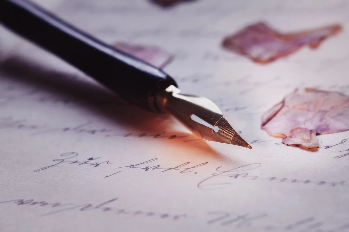
Photo: SamuelFJohanns / Pixabay